Ready to implement a frictionless user experience? Check out these sign up flow examples from real companies.
1. Clear Value Proposition
A frictionless registration flow shouldn't require a ton of user information, but the landing page still needs to demonstrate your product's main value proposition. This confirms the user's belief that their problem areas will be addressed by completing the sign up process.
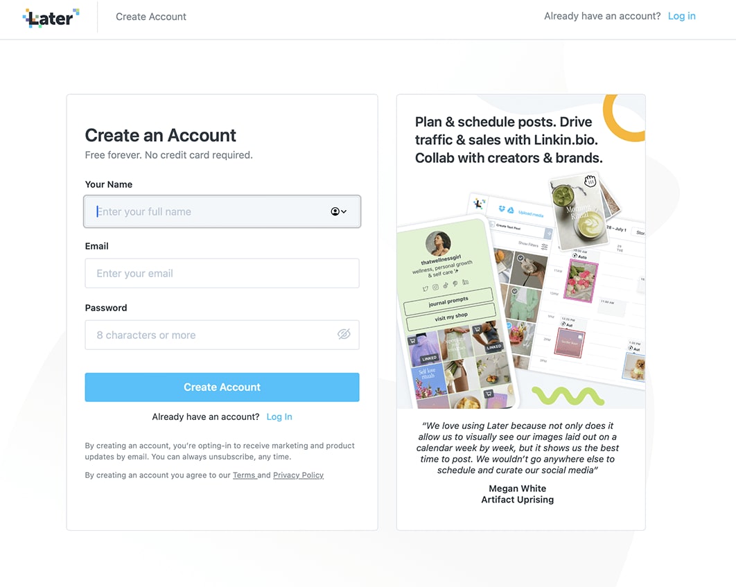
Later, a social media management tool, has a basic sign-up page when it comes to required information. But the platform does an excellent job of clearly defining the benefits of creating an account:
Planning and scheduling posts
Driving traffic and sales
Collaborating with creators and brands
If you don't already have clear messaging on your brand's value proposition, your sign up page is a great place to start.
2. Minimized Form Fields
Reducing the number of form fields makes it easy for people to sign up without a huge time commitment or worry that their personal data is being collected. Abandoned forms are less likely because there are only a few basic fields to take care of in order to access at least some product features.
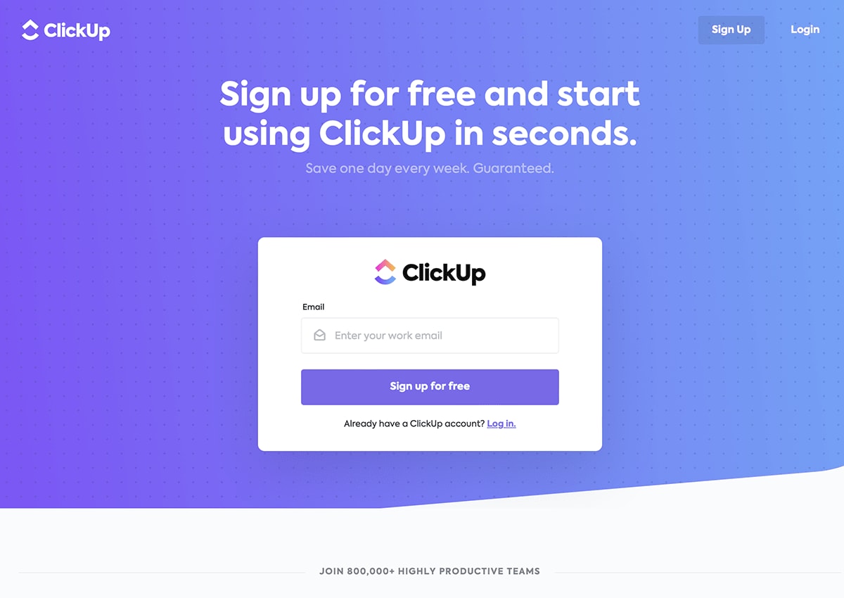
ClickUp is a project management tool with a minimal but effective sign-up page. Users only need an email address to get started; in fact, users don't even have to enter their name on the first page. The copy on the form even boasts that users can start using the project management software in just a few seconds. And with low monthly pricing, it's clearly in ClickUp's best interest to simply get users in the door to start using the product before convincing them to upgrade to a paid plan.
3. Social Media Sign Ups
Incorporating social media sign ups into your registration flow comes with a few different benefits. For starters, it reduces friction because users don't have to create a new username or password — they're simply reusing what they already have. Plus, your data will be cleaner because you don't have to worry about people entering incorrect information.
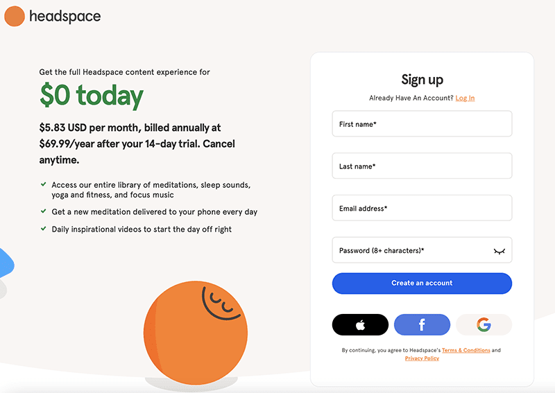
Headspace is a mediation app that allows users to sign up via social media instead of creating a unique login. The form connects with Facebook, Apple, and Google, making it extremely accessible. Anyone downloading a mindfulness app on their smartphone, tablet, or computer is very likely to have at least one of those three accounts.
4. Progressive Profiling
Progressive profiling involves collecting information in a series, rather than in one single form. This can be done over time or by spacing out the sign-up form. One benefit is that users feel more engaged when clicking through the sign up process, especially when only having to enter one piece of information at a time. Additionally, it adds a bit of friction, which can increase the quality of leads brought in through the sign-up form.
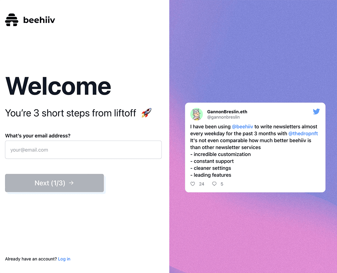
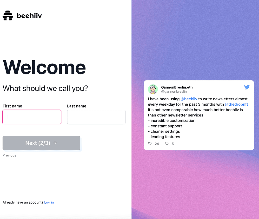
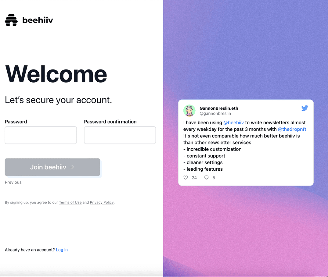
Beehiiv, a newsletter platform, asks for user information over a series of three pages. It's still extremely basic information, but the process feels more personal and interactive. Plus, the conversational copy on each page shows off Beehiiv's personality, making the sign up process about the user and not the company.
5. Email Verification
Email verification does add an extra layer to the sign up flow, but it ensures a higher-quality database of users. You'll worry less about spam accounts and excessive bounce backs when you email your list. Plus, you'll verify that users' email addresses were typed in correctly. Ultimately, it gives you clean data and an extra layer of fraud protection.
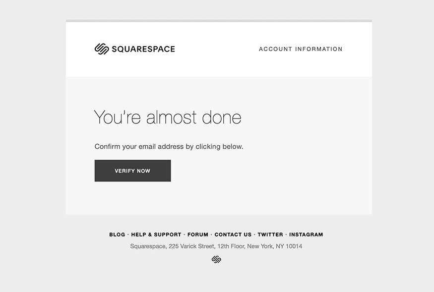
Squarespace protects against spam by incorporating a one-click email verification. It takes very little extra time for the user. Plus, since creating a website is already a hands-on process, the additional step is unlikely to deter users from moving forward with their account.
6. Autofill Forms
Incorporating autofill into your sign-up form removes friction and increases data accuracy from your leads. Autocompletion features fill in common data fields that are already saved on the user's device, such as name, email, and address. It can also allow autofilling saved credit card numbers in your sales form.
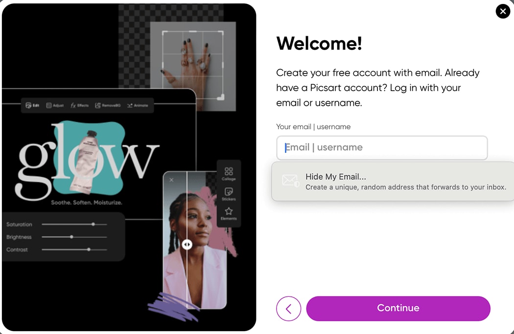
Depending on the user's settings, Picsart is an example of autofill options for initial sign up. It already offers a minimal form, and the process is simplified even more by enabling autocomplete features.
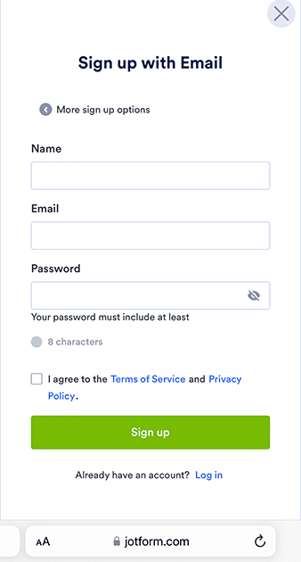
7. Mobile Optimization
A key component of any frictionless sign up flow is a mobile-friendly process. Mobile traffic accounts for more than half of all internet usage, so it's important to make sure your registration page seamlessly transitions between different types of devices.
Jotform, an online form creator, showcases a mobile sign up process that is simple but extremely user friendly. It's frictionless in the minimal amount of information needed to access the platform, and on top of that, users can see it's easy to tap their way through the different options. Users can exit or view more sign up options without having to navigate or refresh on their browser.
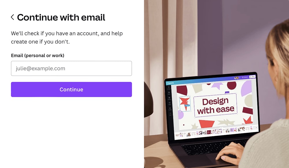
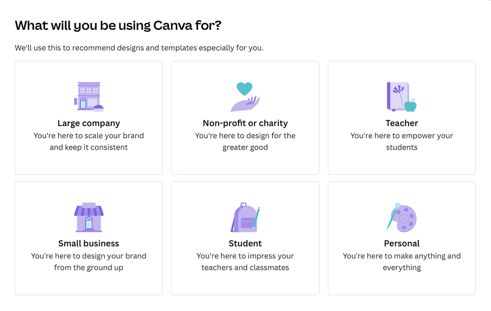
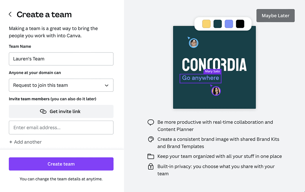
8. Guided Onboarding
Even with a minimal sign up process, you can still showcase your product's value by incorporating a guided onboarding sequence. It's a fast way to highlight popular features without being overwhelming. Plus, you can include an easy exit button for people to opt out if they're not interested. An onboarding process allows people to get started with a free version of a product and build a foundation for upgrading to the paid version as they become more familiar with it.
Canva's sign up flow examples demonstrate how easy it is to start with a frictionless sign up process and move through a personalized onboarding process. Users just need an email to start, and they can then customize their experience by sharing how they plan to use Canva's design services. From there, users can create a team if they’re using the platform for business purposes. Finally, users have the option to explore Canva Pro features with a free trial.
9. Personalization
Even with a frictionless sign up process, you can still add some personalization. The benefit is that potential customers feel like your product understands their specific pain points without being overwhelmed by an overly complex registration process.
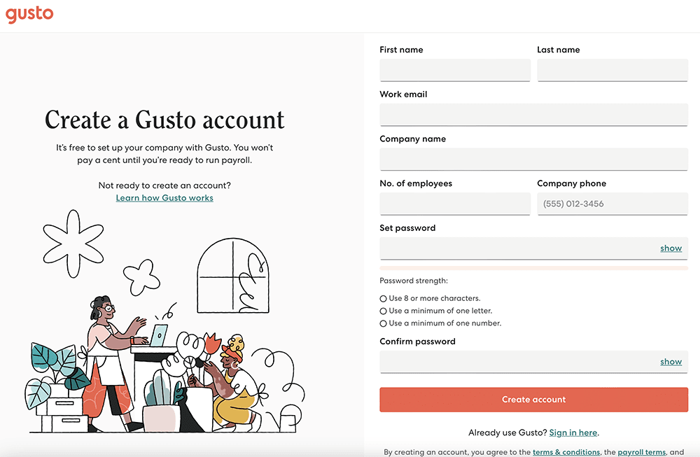
Gusto, an online payroll service, creates a great balance between personalization and easy sign up. Beyond basic contact info, users must also enter their company name and the number of employees. It's not an overwhelming amount of additional information, but it's enough where a human resources employee knows they'll get paired with the right solution whether they need payroll services for just a handful of employees or for a large company with thousands of staff members.
10. Show Progress
If you have a few different information fields you want to collect during sign up, consider showing the user their progress as they complete the form. It's an easy strategy that makes sure the process isn't overwhelming. They can see they're almost done, so you're less likely to have incomplete sign ups
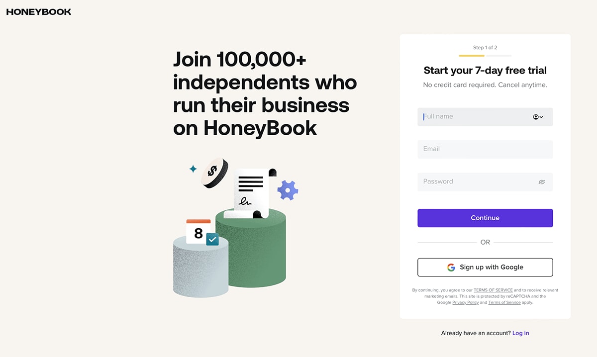
HoneyBooks is a client management platform that clearly shows it has just a two-step process to sign up. It's low stakes because it's a free trial and users don't need to enter a credit card. Once users enter their name, email and password, there's just one additional step to finalize sign up.
11. Use Specific CTAs
In addition to a frictionless sign-up form, you also need a catchy call-to-action (CTA) that makes a user eager to register. While you may be tempted to use the default "sign up now" button, adding a quick line highlighting the user's outcome can help increase conversions.
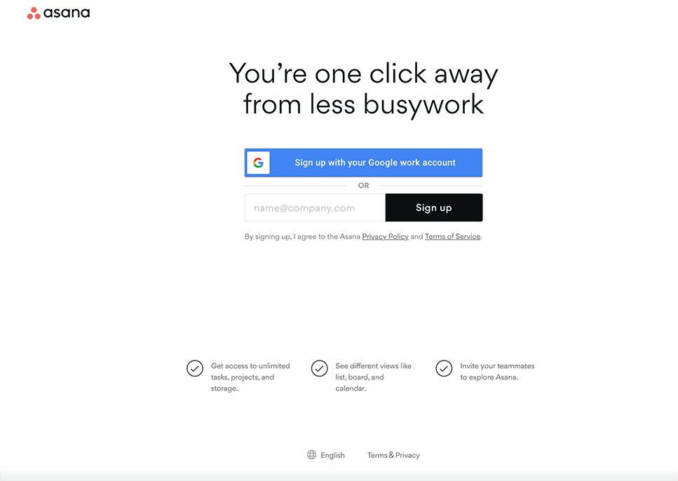
For the busy professional looking to streamline collaborative projects, Asana creates an extremely attractive CTA on its sign-up page: "You're one click away from less busywork." From there, all users have to do is connect their Google work account or other company email address to begin accessing the platform's project management features.
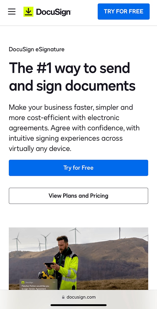
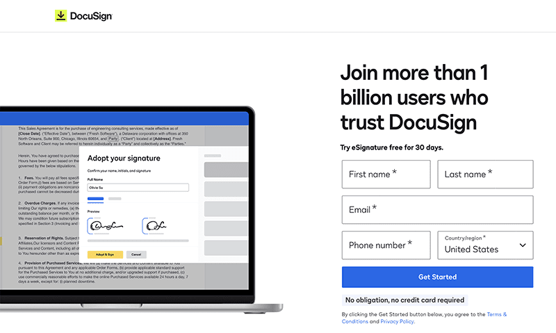
12. A/B Testing and Optimization
It's important to continually analyze your data in order to optimize the sign up process for users. Utilize A/B testing to try out different registration forms and CTAs to find out what format and messaging resonates with your target audience. You could try highlighting different benefits or requiring a different number of fields. Compare results in order to focus your sign-up form on the most effective process.
DocuSign has different headlines for different search terms. Both instill trust but meet the user at different points in the journey. One focuses more on the company's benefits with an additional button to click before signing up. The other has a single statement headline, immediately followed by a few required registration fields. DocuSign can test these different landing pages and push the one that performs better.